JSS + Associates | Mumbai
Rallying a new generation to build a better Mumbai.

- Client
- JSS + Associates
- Scope
- Brand strategyVisual identityVerbal identity
- Year
- 2026
- Location
- Mumbai
- Status
- Complete
- Website
- jssplusassociates.com ↗
The brief
JSS + Associates designs the buildings Mumbai actually lives in. Their problem was getting young architects to want to.
Real estate architecture is serious, lucrative work. It is also the field architecture students tend to skip. It doesn’t look glamorous from a college studio, so the best graduates look elsewhere.
The firm had everything a young architect could ask for: real projects, a dedicated young team and work that shapes a city. It just wasn’t coming across.
They came to us to help them attract talent. We started with the story.
A rare combination
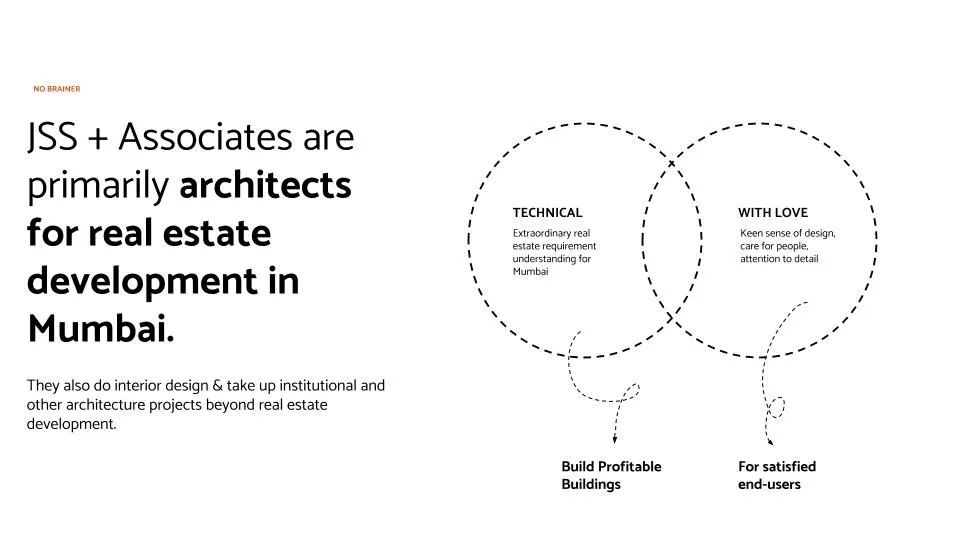
Spend time with JSS and one thing stands out. They care about two things most firms treat as opposites.
They know exactly what a Mumbai development needs to work commercially. And they design with soul: a keen eye, care for the people who will live there, attention to every detail.
Buildings that are profitable for the people who build them and loved by the people who use them. That is harder than it sounds, and rarer.
From buildings to a skyline
“Architects for real estate development” is accurate. It is also the sentence that makes a student scroll past.
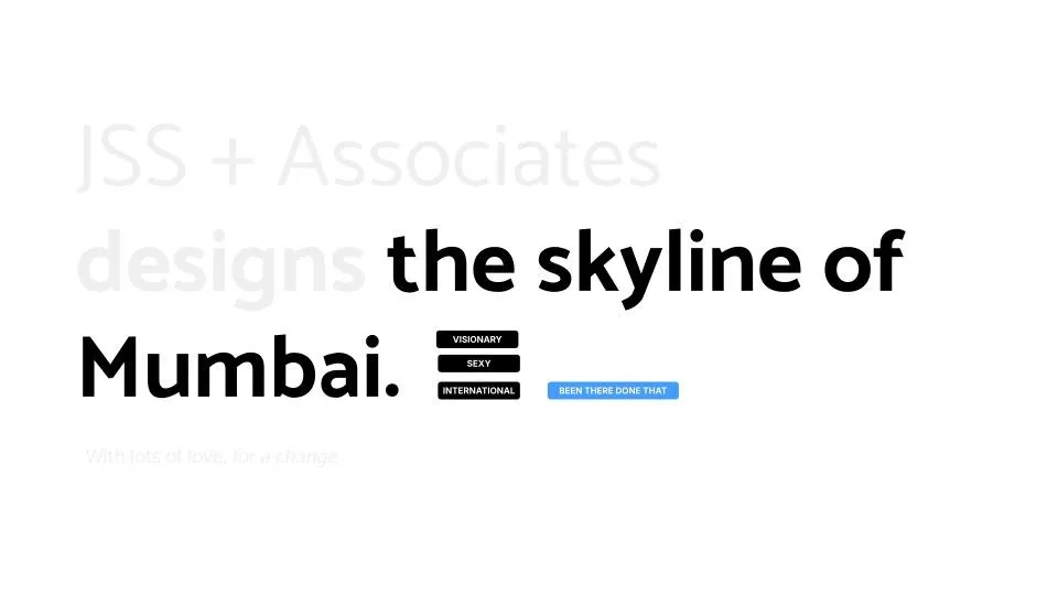
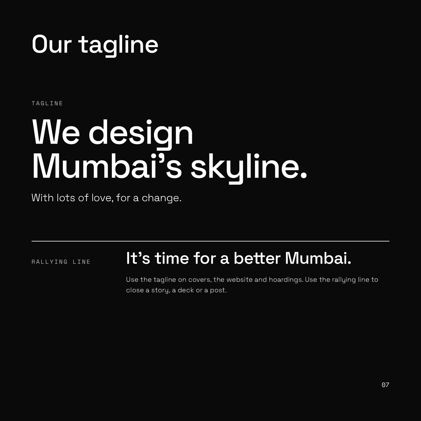
So we changed the scale of the story. JSS + Associates designs the skyline of Mumbai. With lots of love, for a change.
Every part of the line has a job. “Designs” keeps it about craft. “The skyline of Mumbai” makes it visionary, and a little bit sexy. “With lots of love” brings in the care. “For a change” adds the wit, and a wink at how the industry usually works.



A mark with two sides
The identity starts where every JSS building starts: in AutoCAD. We designed the whole brand around the screen an architect spends the day in.
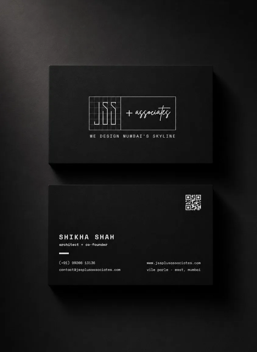
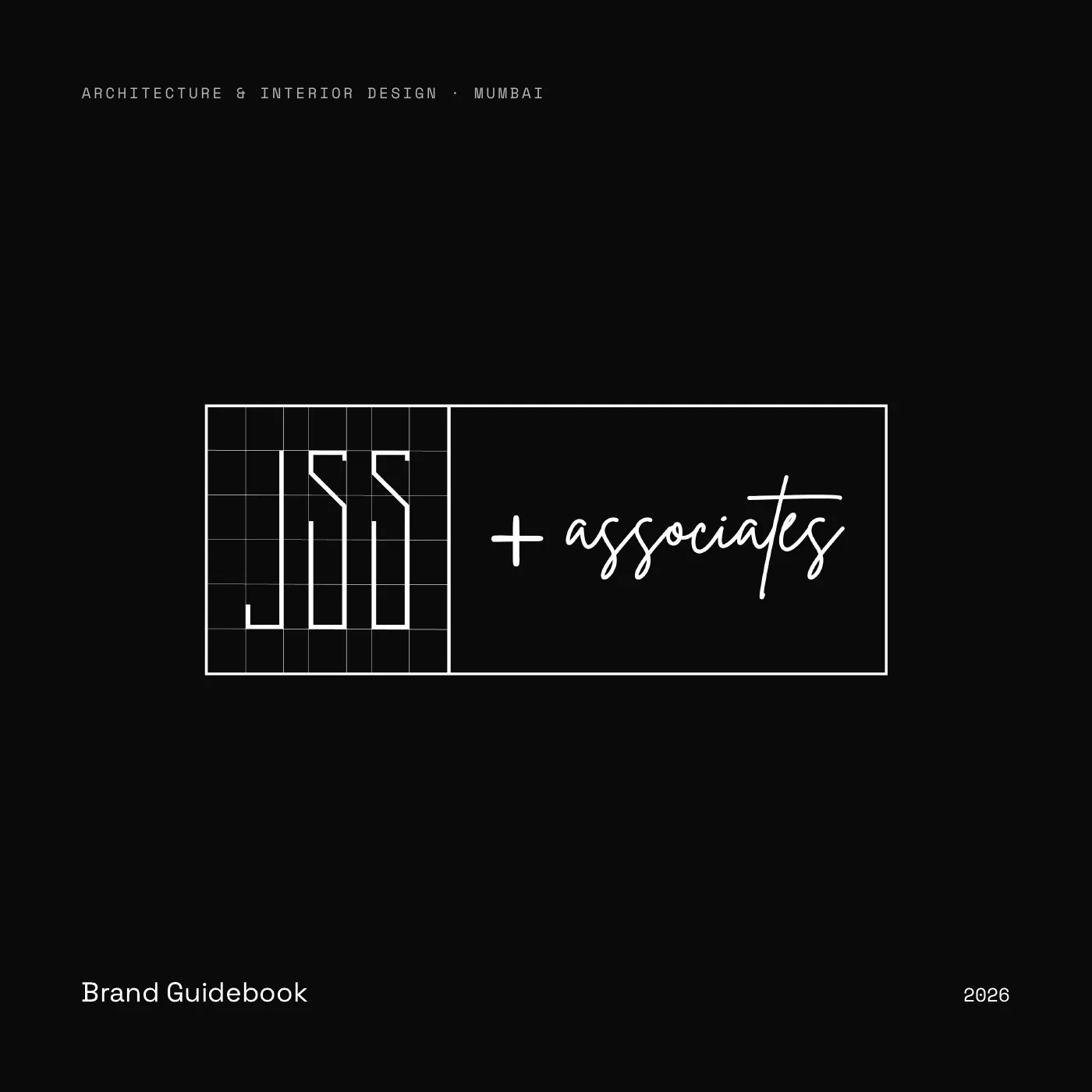
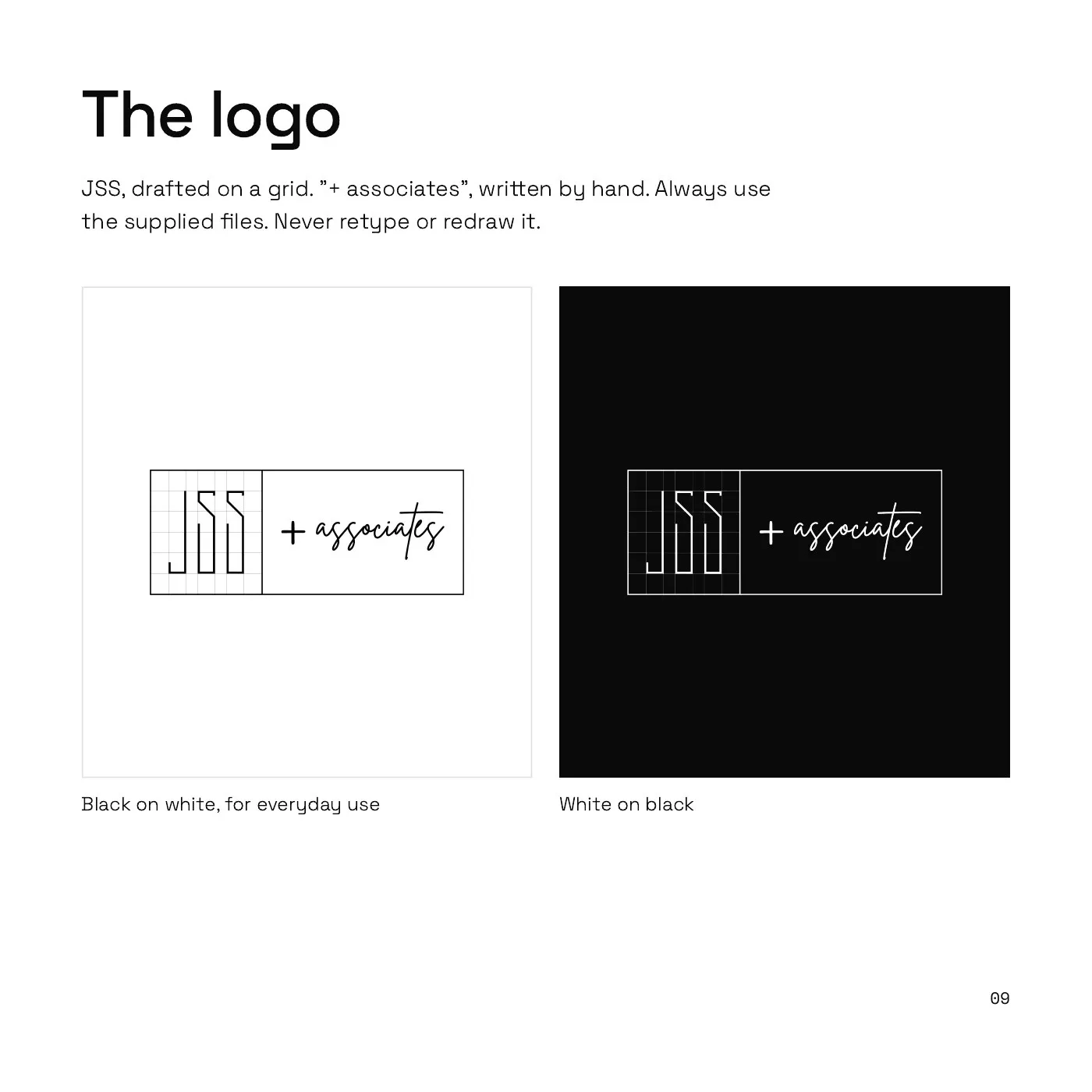
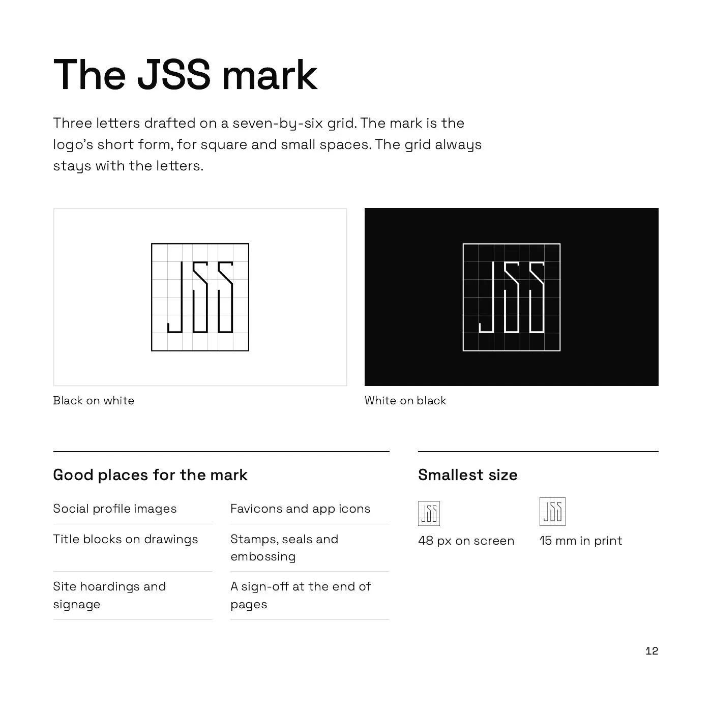
“JSS” is drawn on the drafting grid: precise, structural, built to plan. “+ associates” is written by hand. Technical on one side, human on the other.
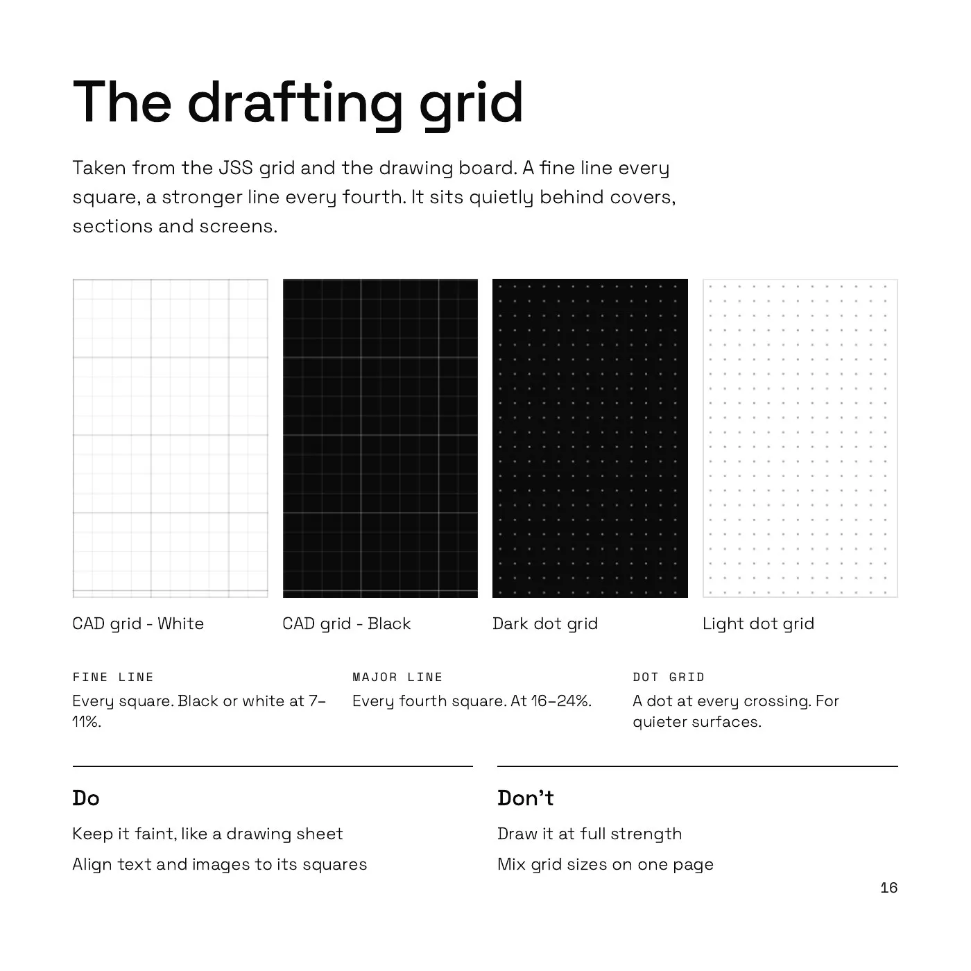
Everything else follows the same logic. The dark canvas, the fine gridlines and the crosshair cursor became the backgrounds, the patterns and the feel of the whole brand. To an architect, it looks like home.




Where people meet it
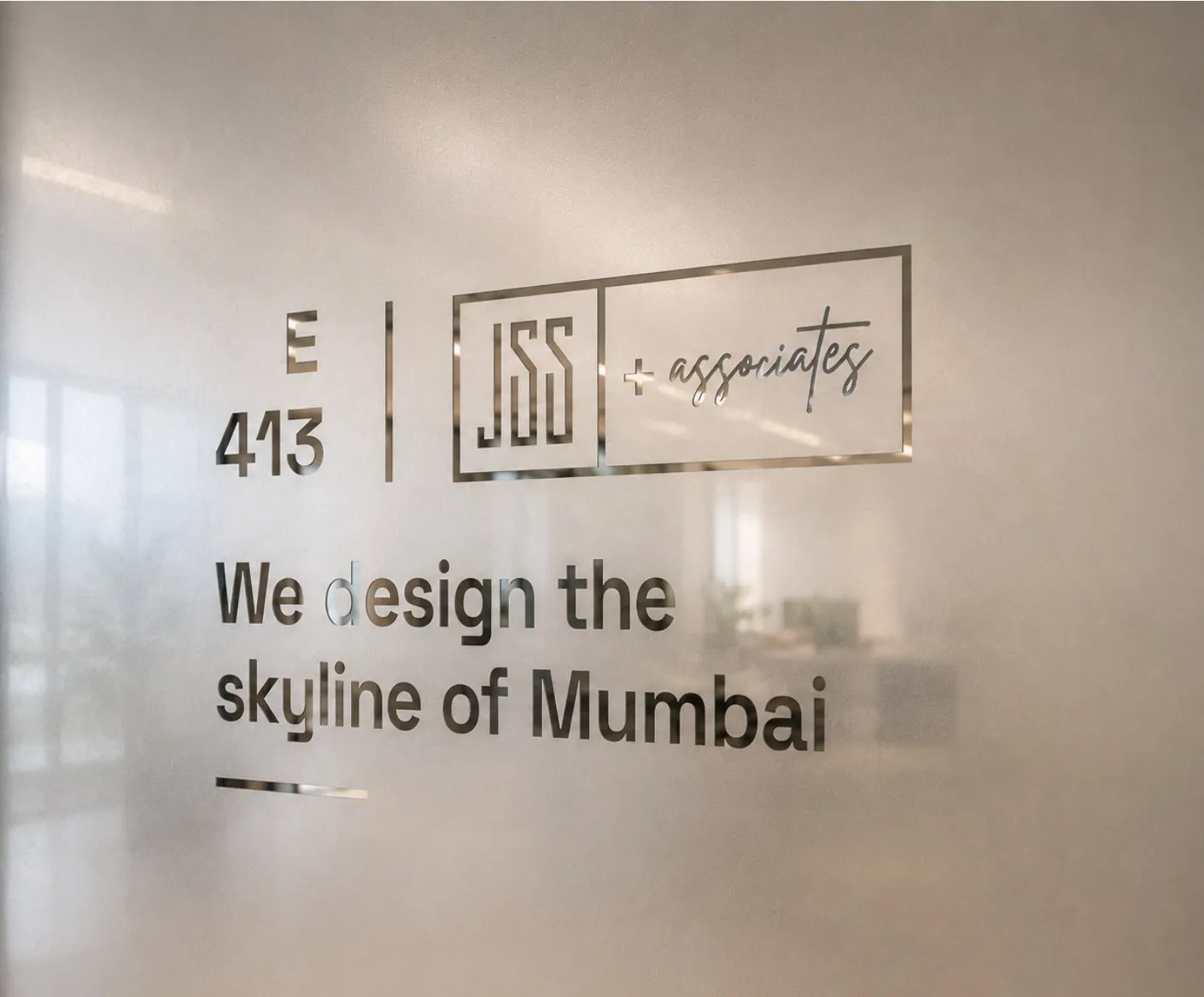
Then we put the story where people would meet it. On the studio door. On the cards the founders hand out. And on a website whose first button reads “Join us”.
For a firm looking for talent, the invitation comes first.
A guidebook to keep it that way
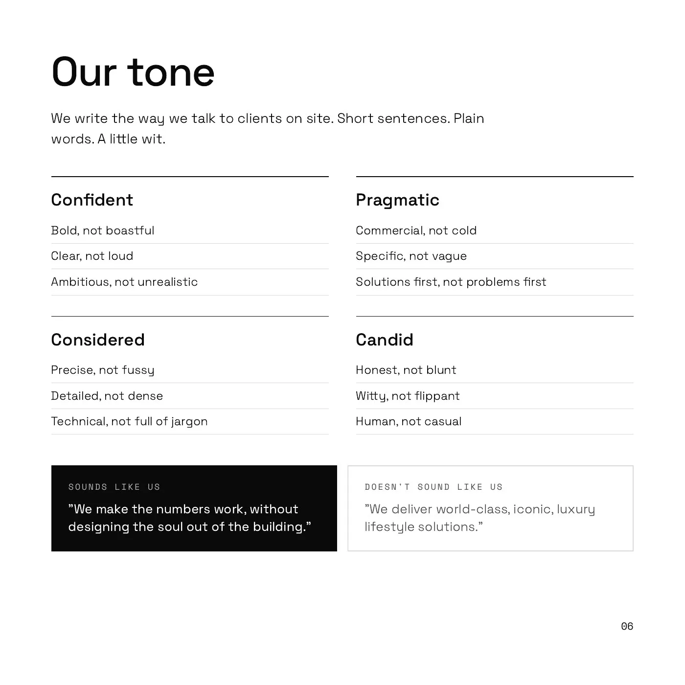
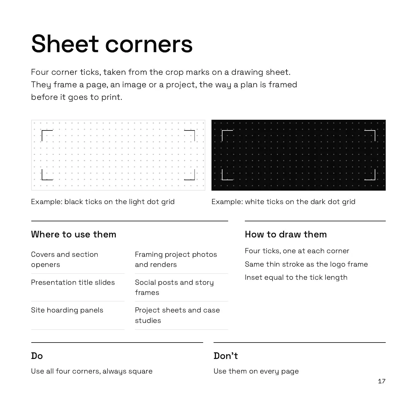
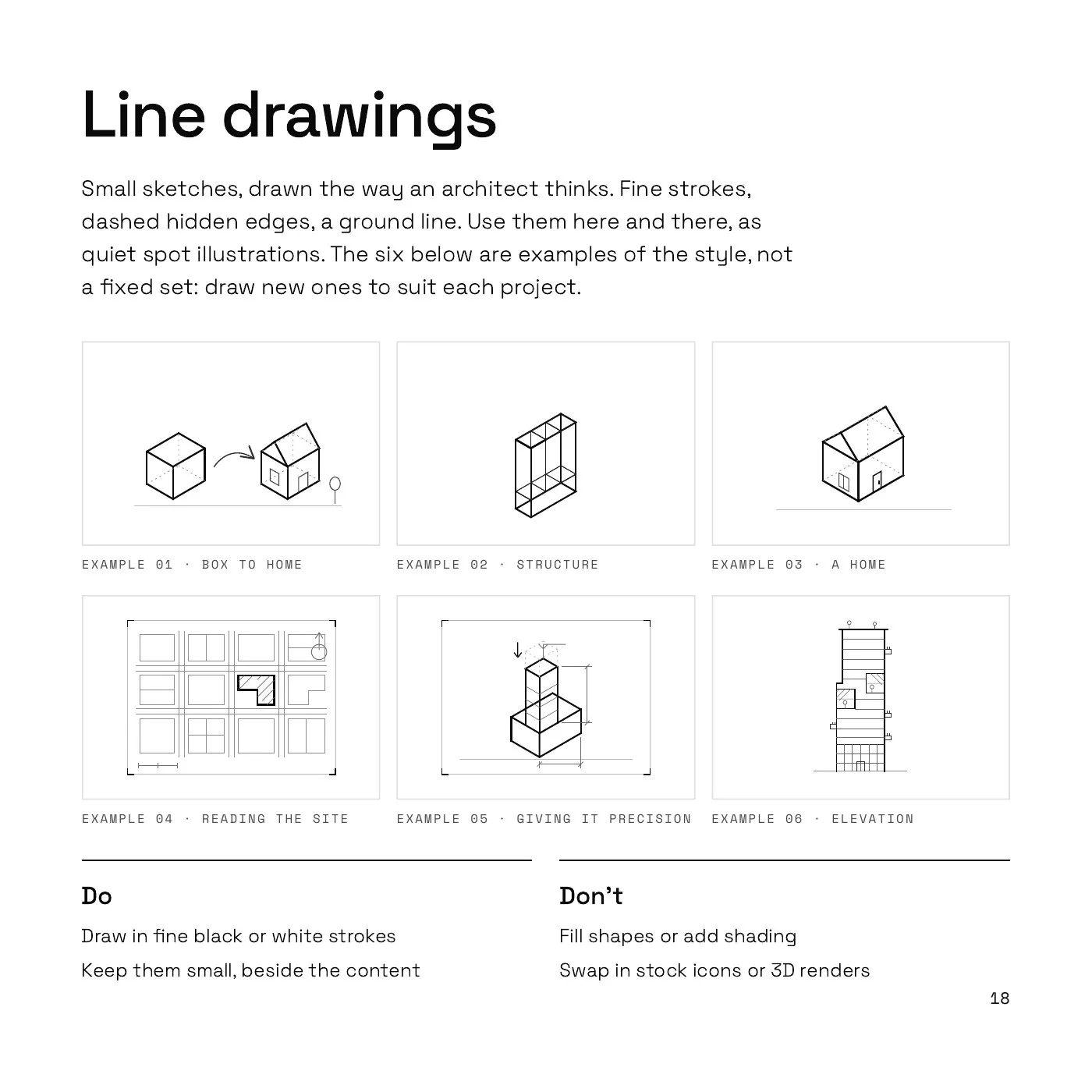
A brand only lasts if the people using it know how. So we wrote it all down: the story, the voice, the logo, the grid and the small details in between.
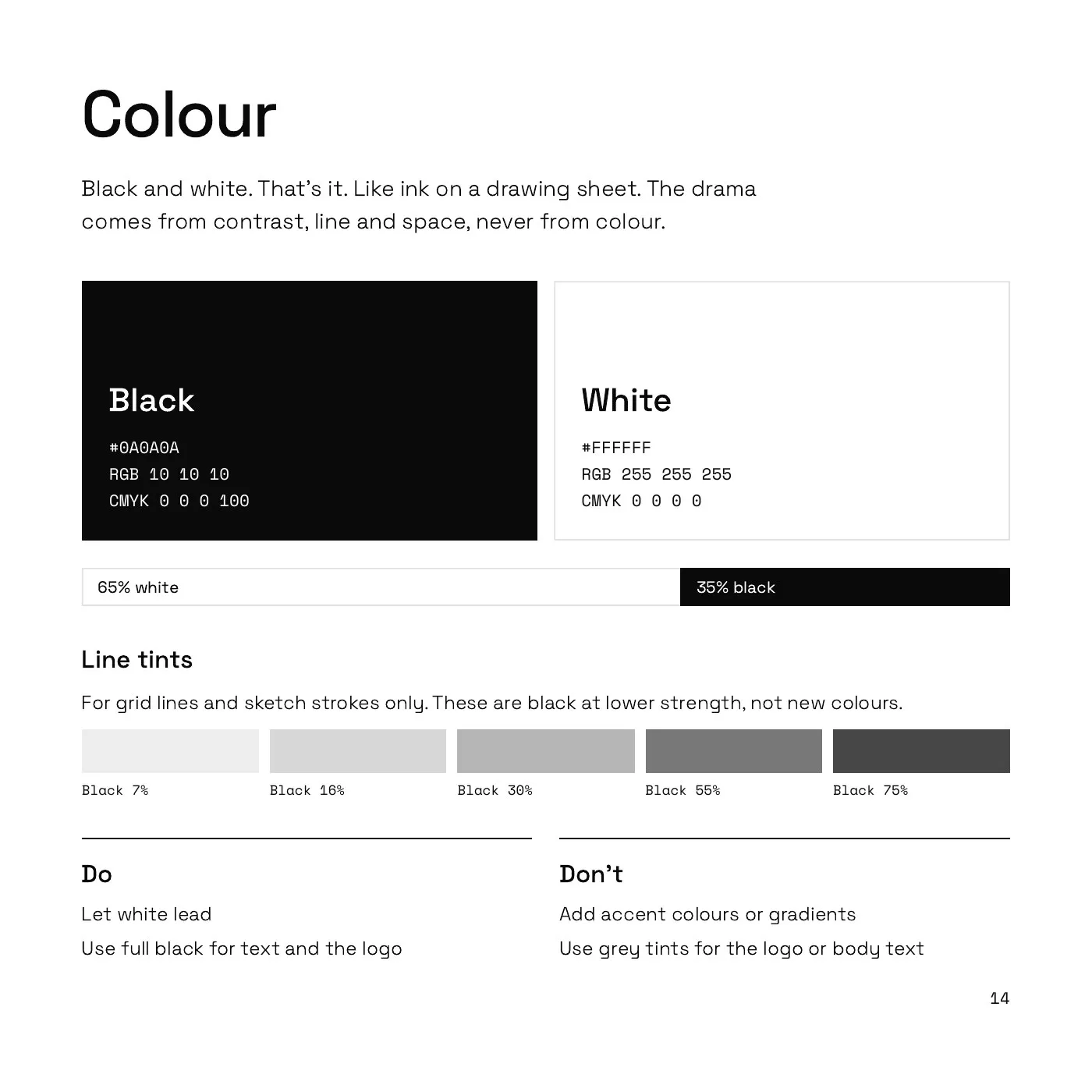
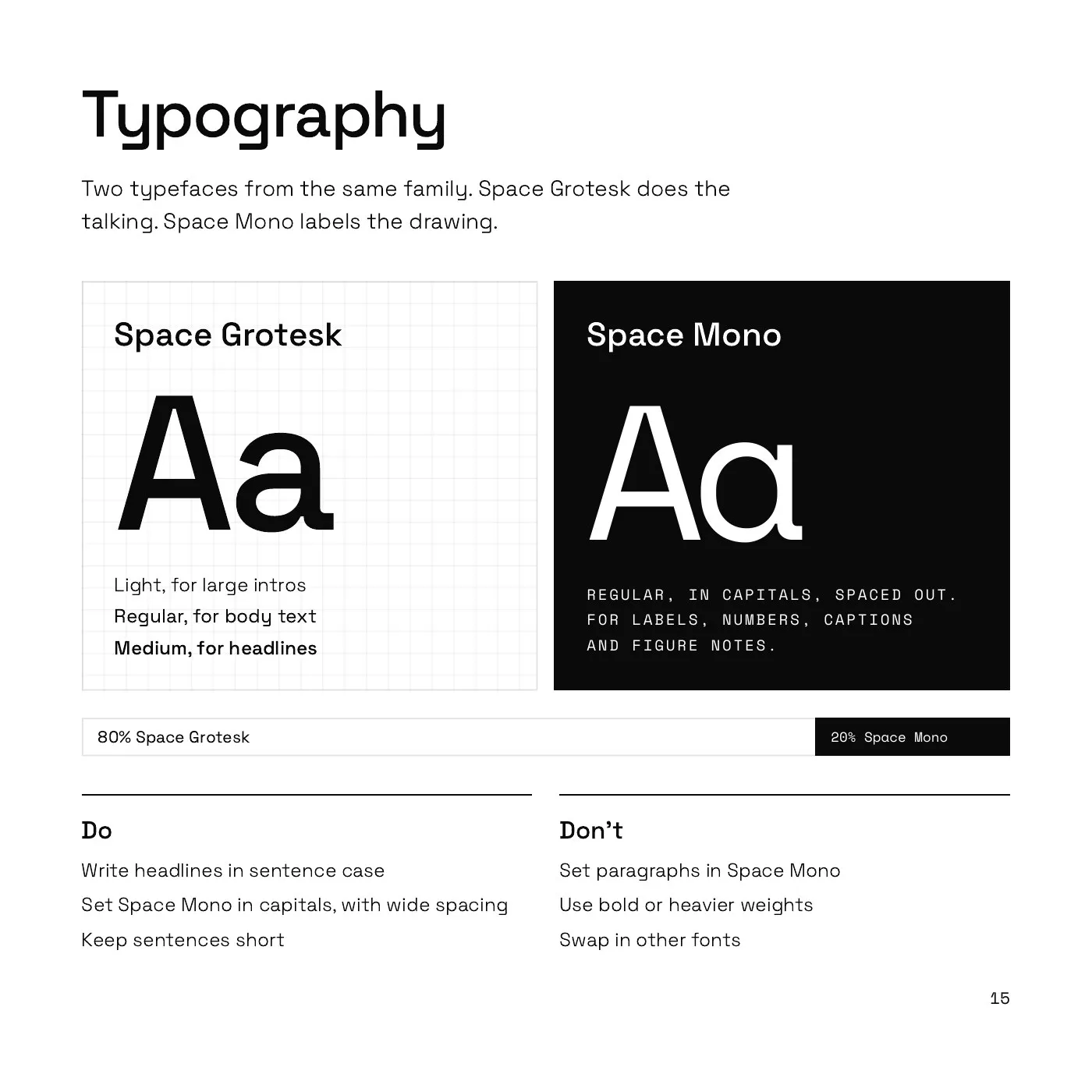
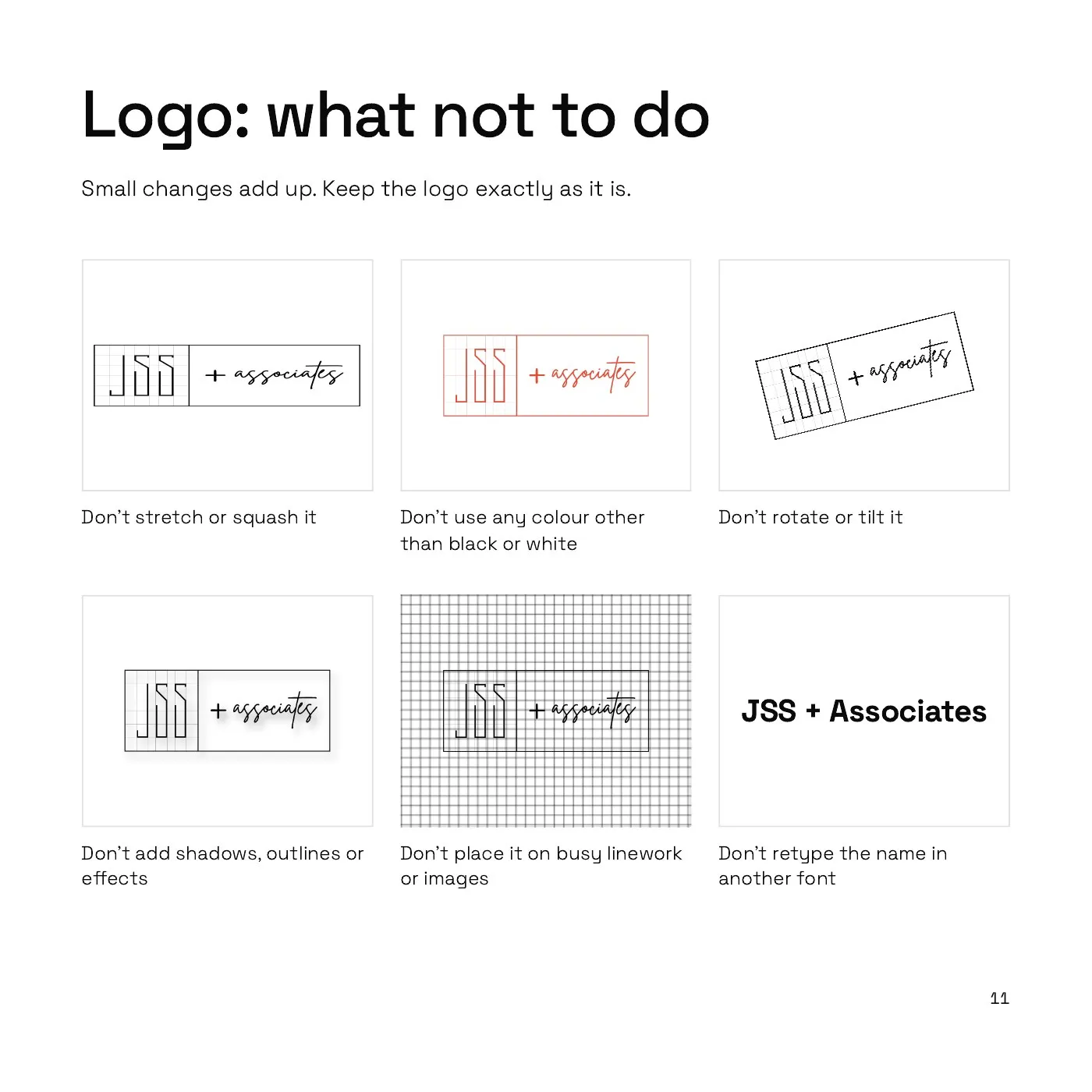
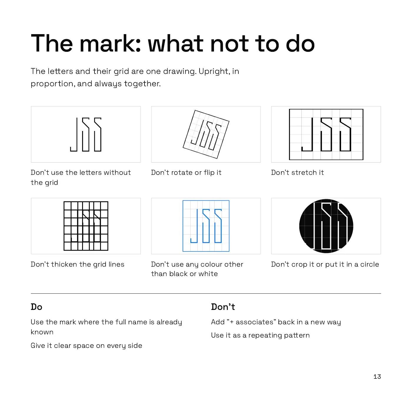
Every page says what to do and what not to do, in plain words. Don’t stretch the logo. Don’t add colour. Keep the grid faint, like a drawing sheet.
“Tells our story better than we ever imagined possible.”
Founder, JSS + Associates