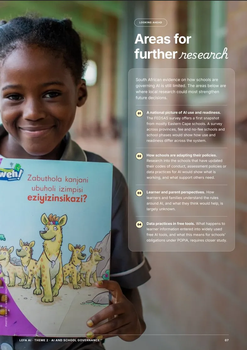
Lefa AI | South Africa
Sparking a national conversation on AI in the classroom.
- Client
- Human Studios
- Scope
- Brand strategyVisual identityDesign
- Year
- 2026
- Country
- South Africa
- Website
- lefaai.humanstudios.org ↗
- Programme partners
-



The brief
Deliverables
- Brand strategy
- Visual identity
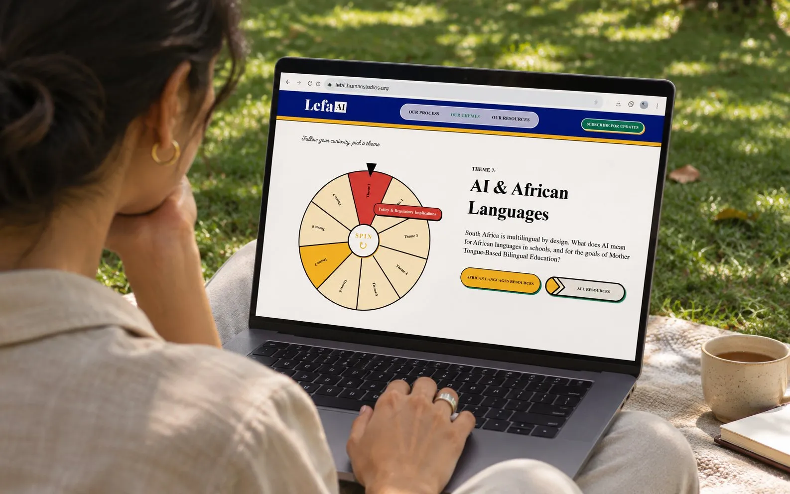
- Website
- Brand templates
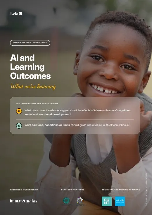
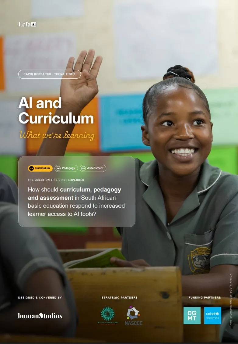
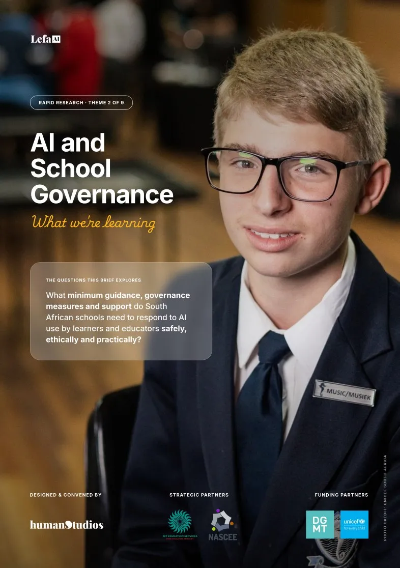
- Research insight briefs and other publications
Lefa AI is a rapid research programme making sense of AI in South African education.
Research like this usually reaches the world in pieces. A report here, a webinar there, a deck somewhere else, each one looking like it came from a different organisation. The thinking is strong, but nothing ties it together, so it is hard to find, hard to trust and easy to forget.
The brief was to do it differently. From the very first day, the programme needed to look and sound like one thing.
What we did
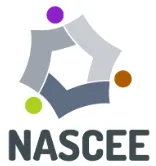
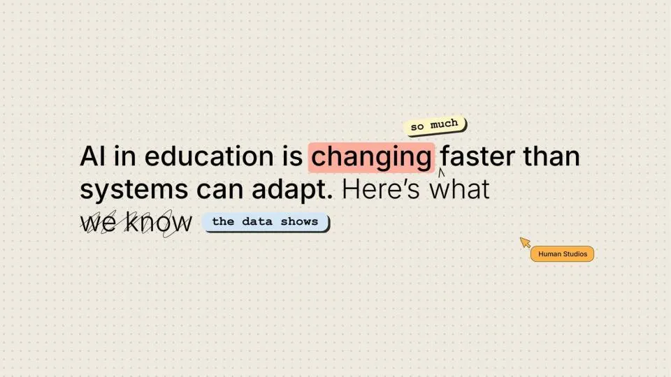
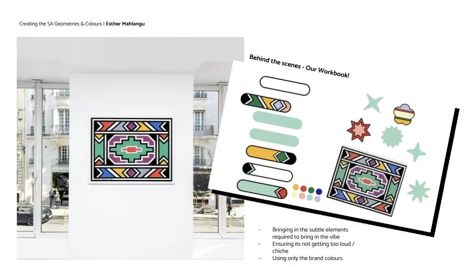
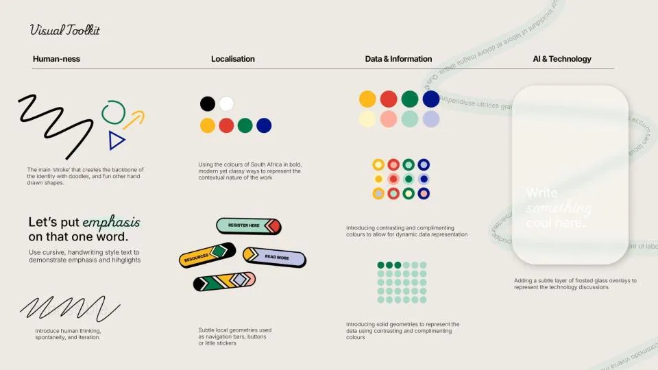
We began with the foundations: a brand strategy, and a visual identity built to stretch across everything the programme would make.
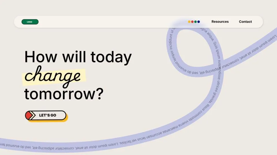
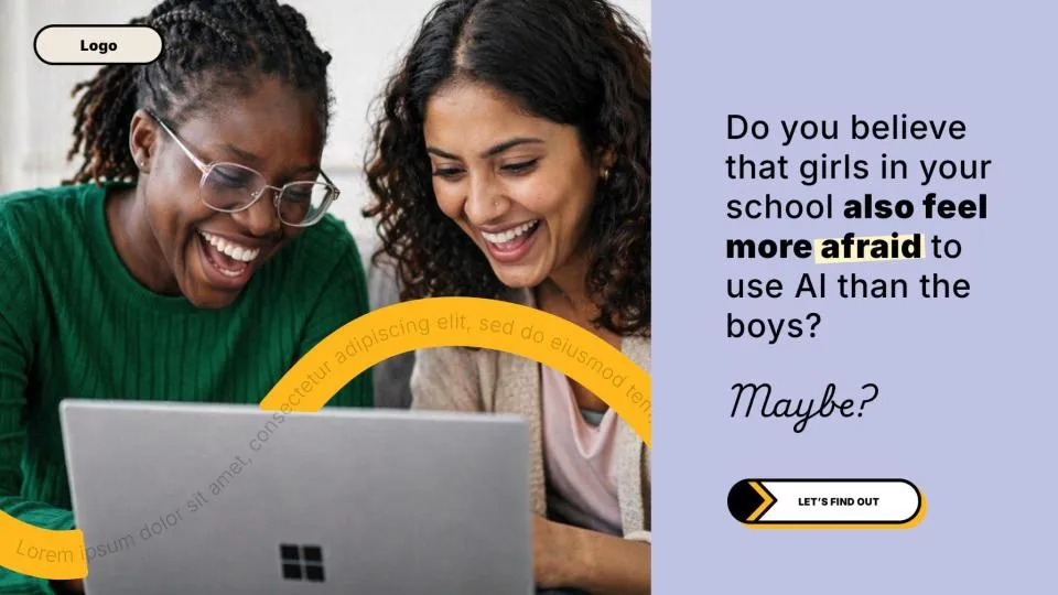
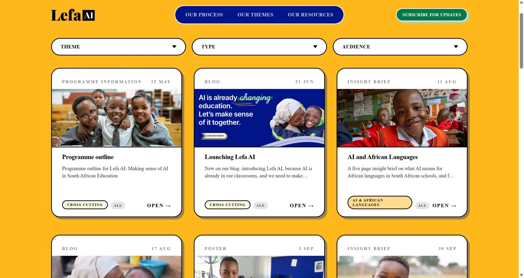
Then we built the website and a set of brand templates, so every new piece could be made quickly and still belong to the same family.
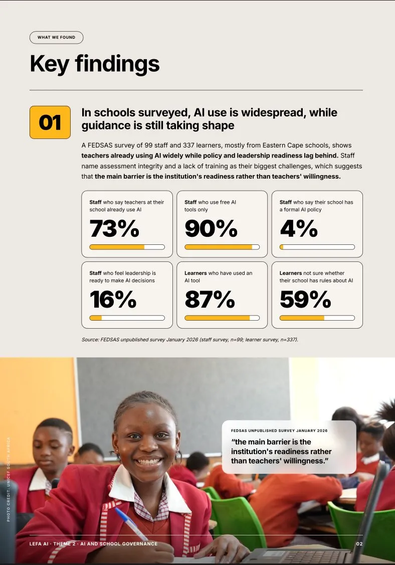
For 10 months we stayed alongside the team. Each round of research became insight briefs and publications that are detailed where they need to be, and designed so the key findings can be understood at a glance.
What changed
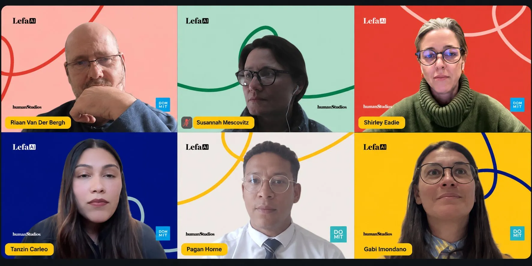
Lefa AI now shows up the same way everywhere: in its research, on its website, in decks, on social media and in webinars.
That kind of consistency is rare for a research programme, and it changed how the work lands. Instead of scattered outputs, every piece builds on the last. People recognise it, take it seriously and come back for more.
What it did
Research made simple
All the research became simple and clear. Reports were well detailed and designed so you can understand everything at a glance.
Professional-looking material
Every piece that left the programme looked like it came from a serious, established team.
Consistency and brand recall
The same look everywhere, so people recognise Lefa AI wherever they meet it.