Quadrock Ventures | India
Unlocking capital for a braver way to build India.
- Client
- Quadrock Ventures
- Scope
- Brand strategyVisual identityVerbal identity
- Year
- 2026
- Country
- India
The brief
Four people. One conviction: real estate in India is ready for something braver.
They came together to start a fund that makes experimental investments in property. The kind that test what a home, a building or a neighbourhood can be, and open up a whole new way of living.
They had the capital and the conviction. What they did not have yet was a name, a story or a face.
We started with questions, not sketches. Each of the four partners answered the same detailed survey: what they wanted to build, who they wanted to back, how much risk felt right, and how they wanted to be seen.
Read side by side, the answers showed where the four already agreed and where they pulled in different directions. The common ground became the strategy: serious about money, open to new ideas, and built to last.
A name that holds four people
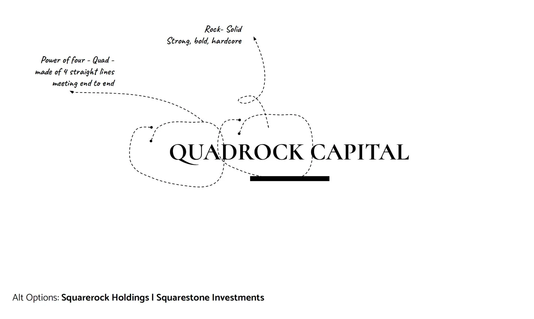
Then came the name. We worked through several routes before landing on one that says it all in two syllables.
Quad, for the four partners. Rock, for the solid ground that property is, and for the kind of partnership they wanted to be. Four partners. Rock solid. Nothing more than it needs to be.
Four parts, one whole
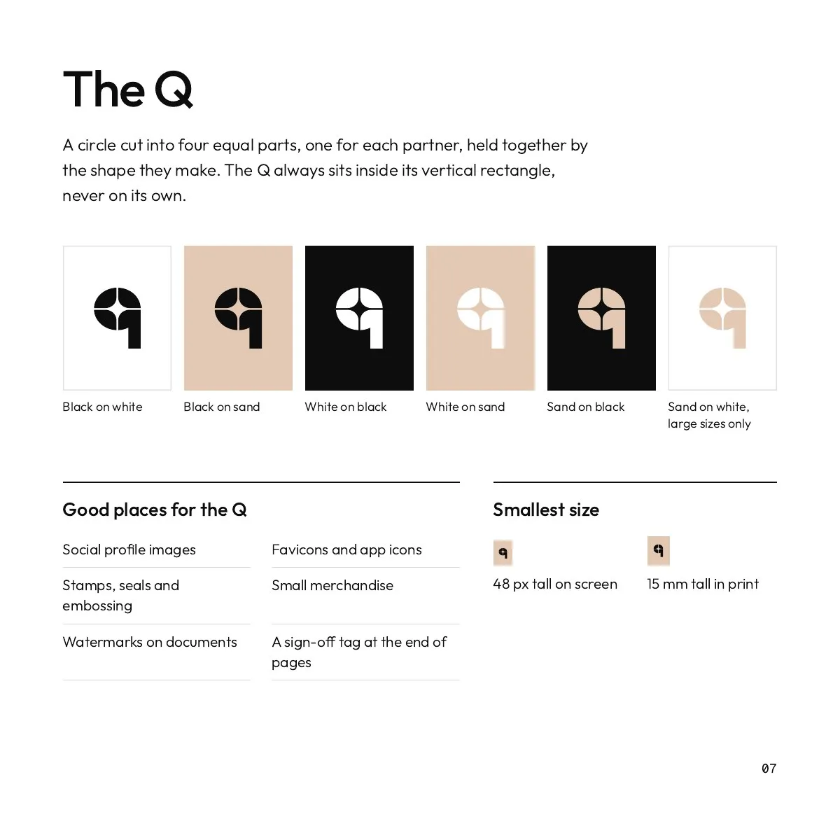
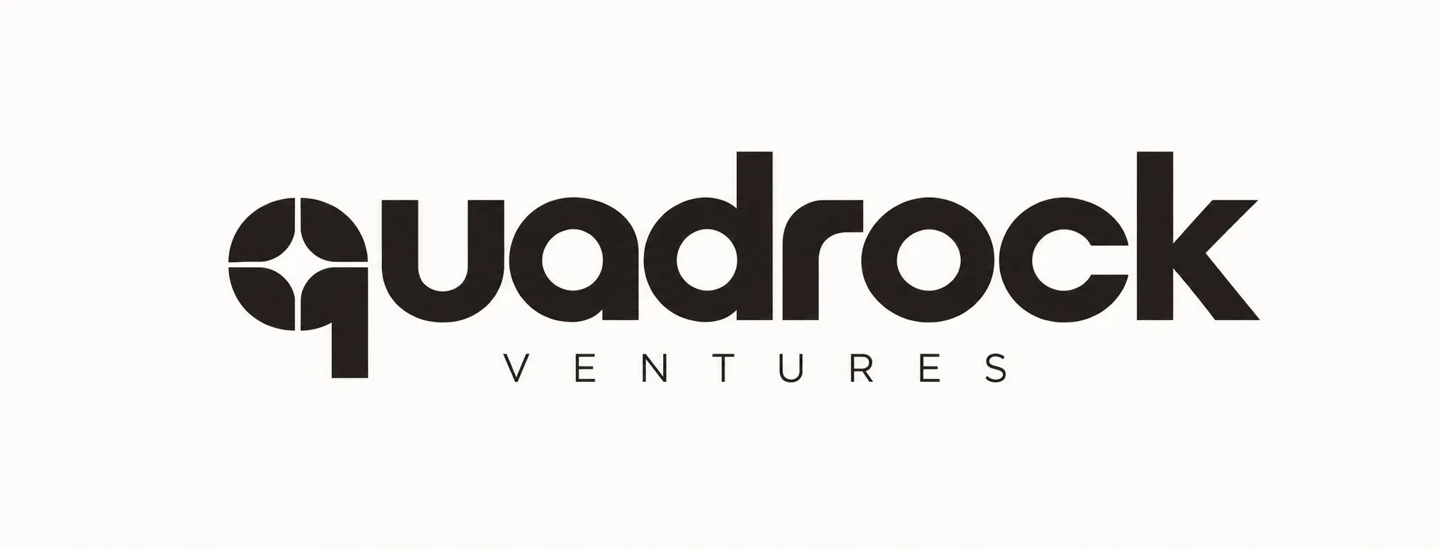
The whole identity grows from a single idea in the q. A circle cut into four equal parts, one for each partner, held together by the shape they make.
In motion, the idea explains itself: the circle arrives, splits into four and settles into the name.
The identity, end to end
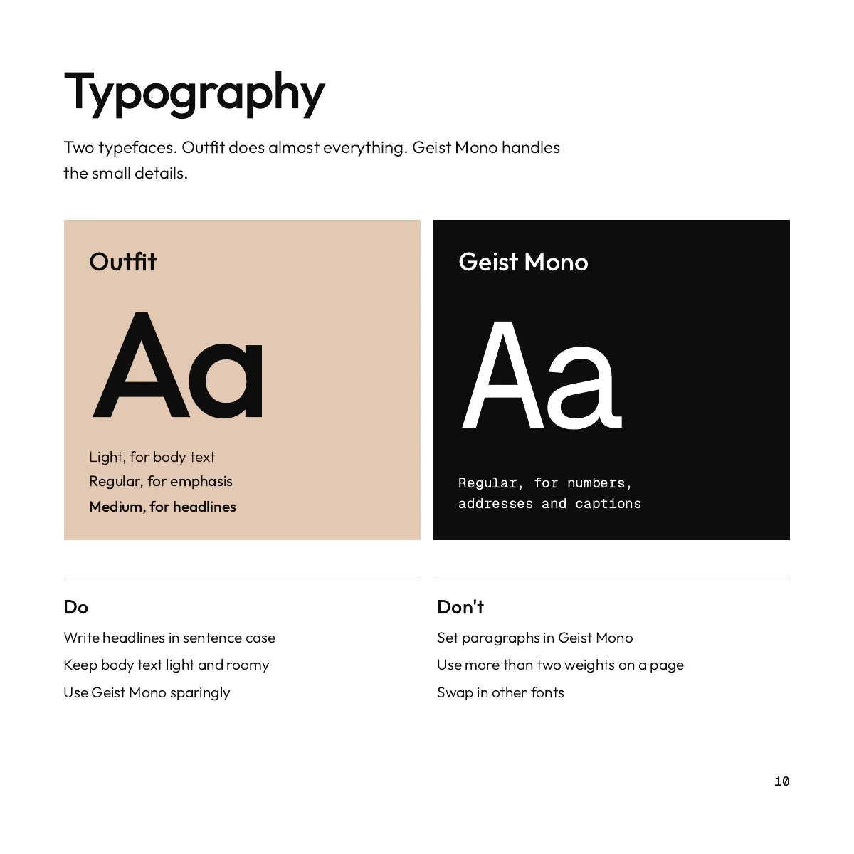
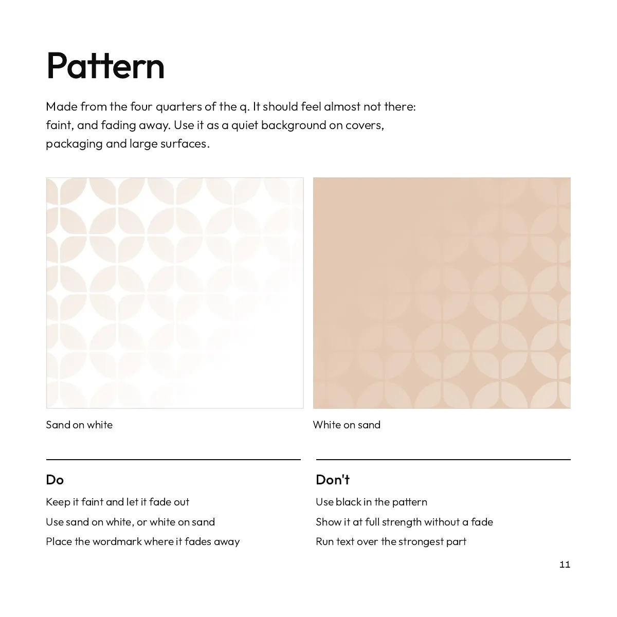
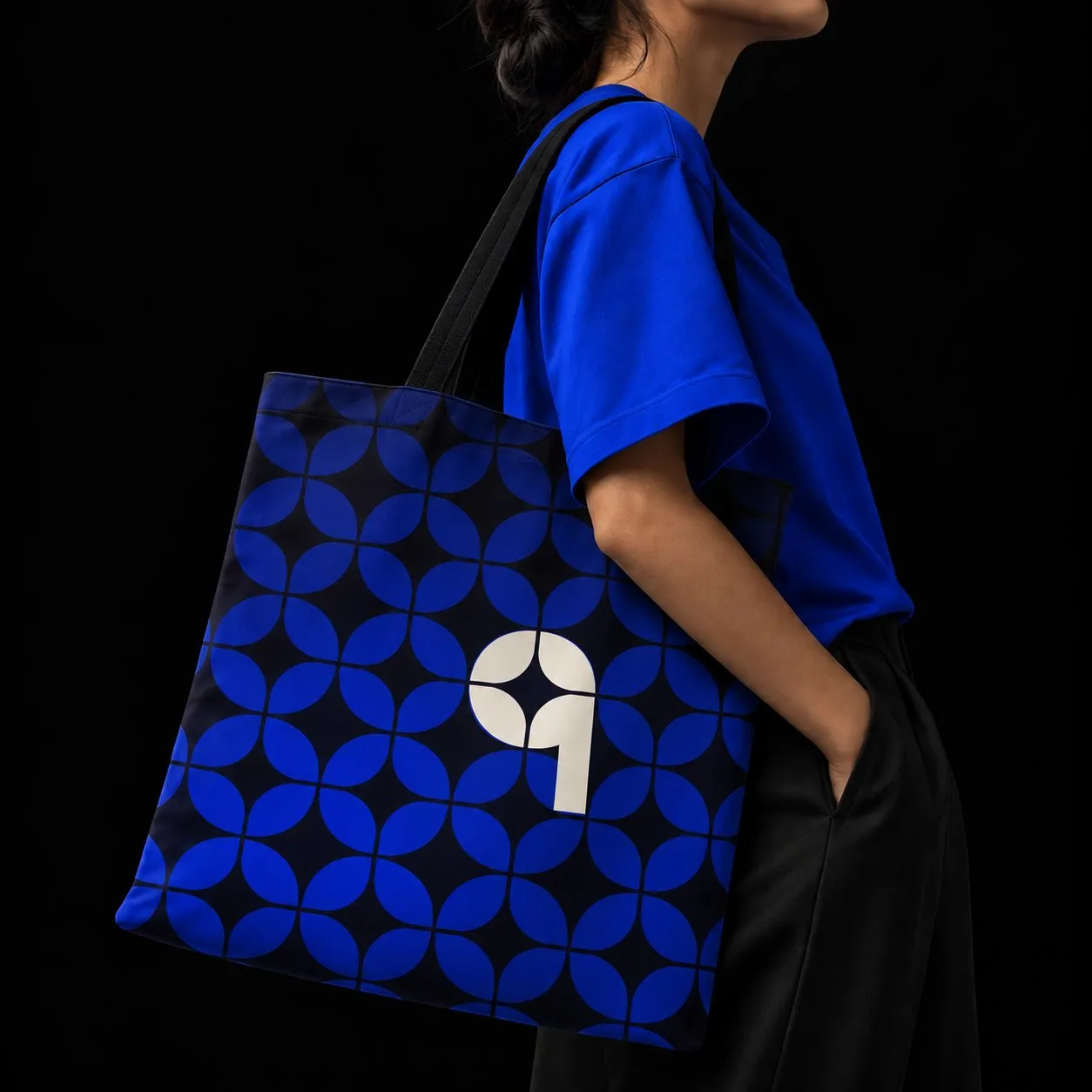
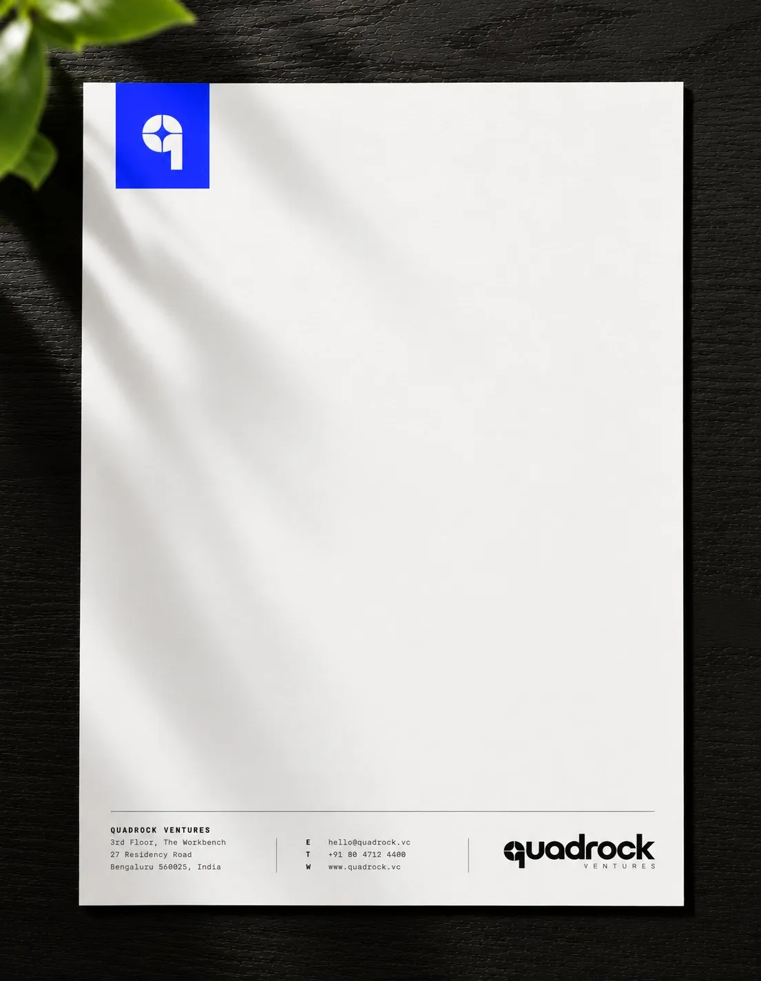
From there it became a full system: colour, wordmark, symbol, pattern, type and the first things people will hold. Scroll inside the frame to go through it.

A guidebook to keep it together
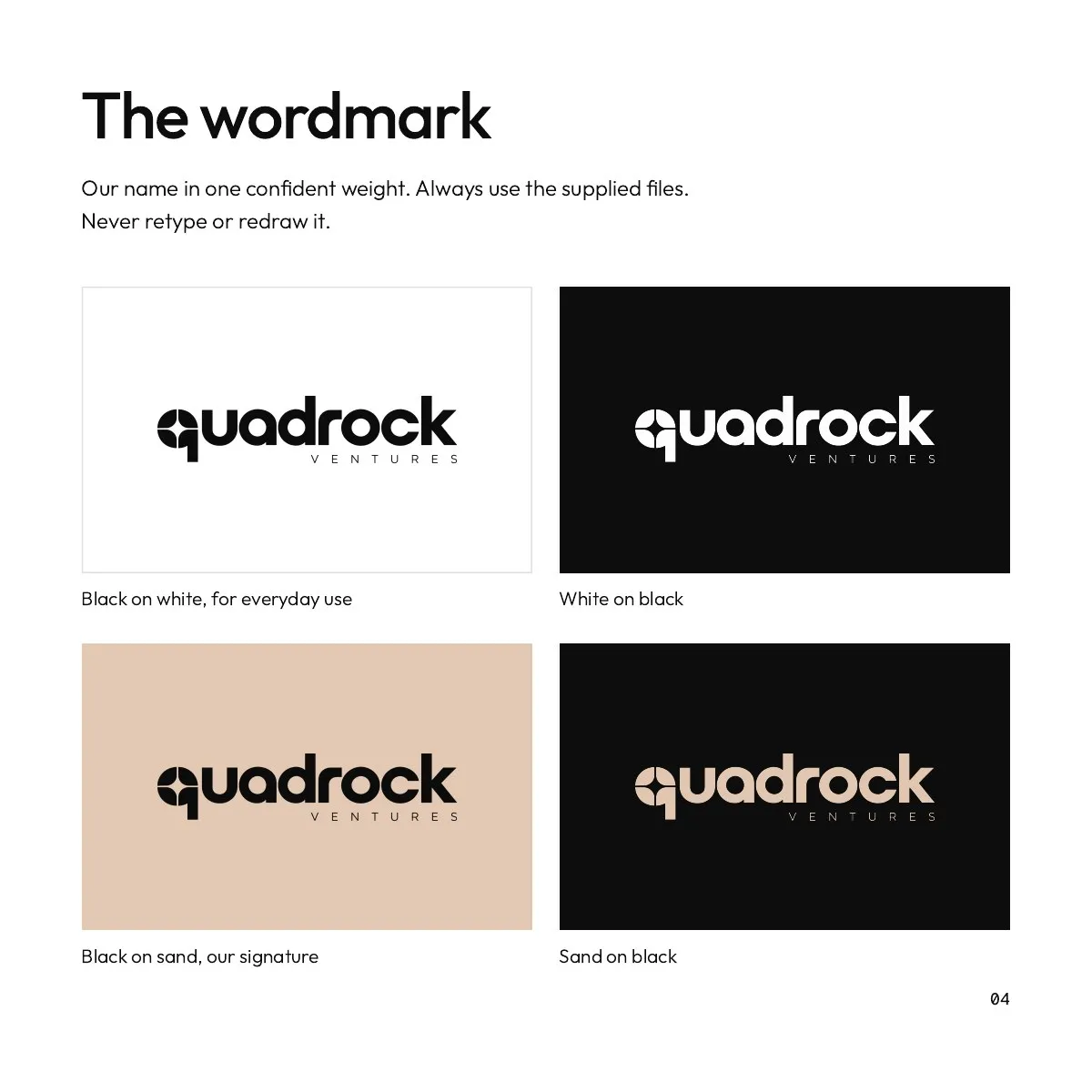
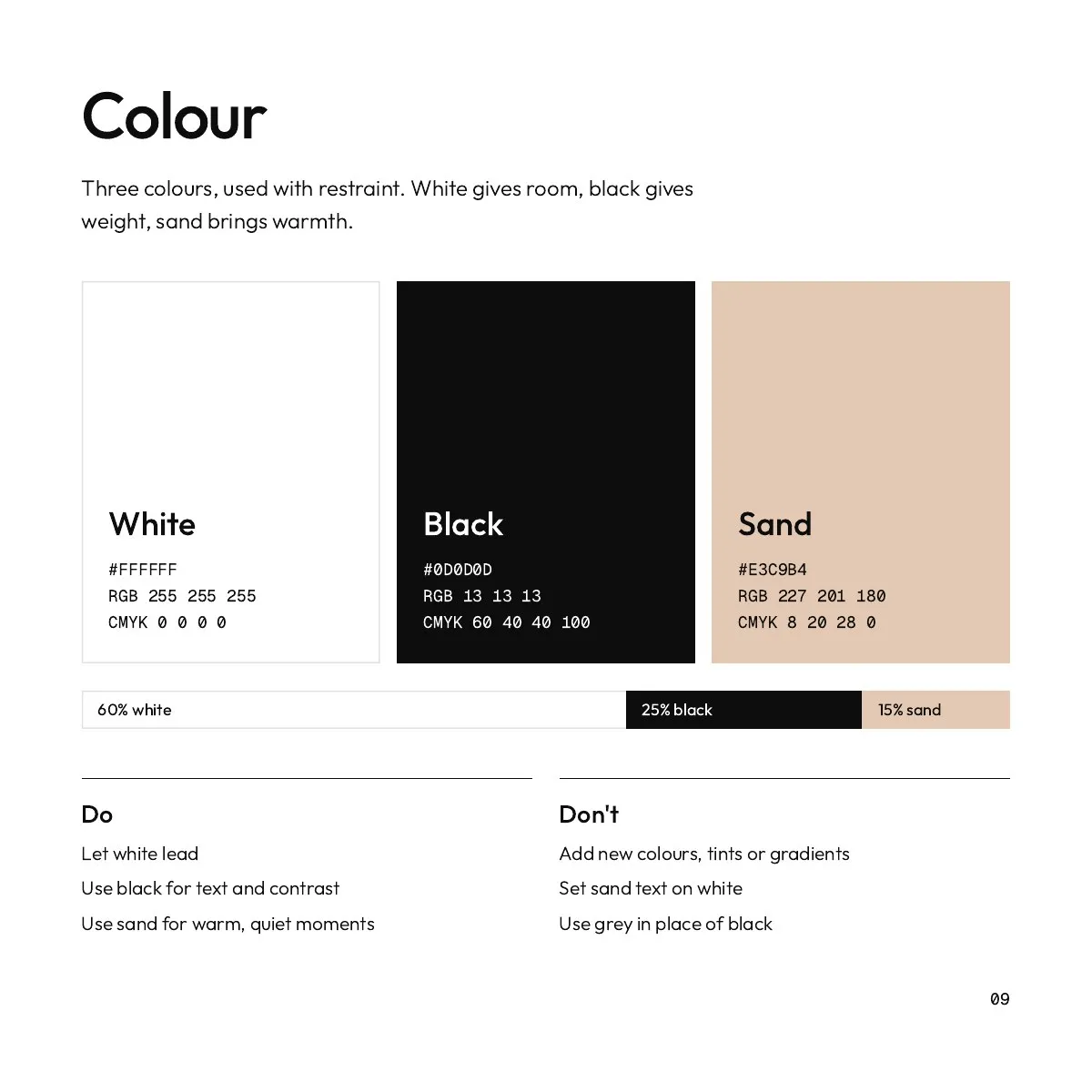
A brand only lasts if the people using it know the rules. So the work ends with a guidebook: how to use the wordmark and the Q, what never to do with them, and how colour, type and pattern fit together.
It is written to be used by anyone on the team, not only designers.