Sensing Local | India
Empowering citizens and governments to speak the same language.
- Client
- Sensing Local
- Scope
- Brand strategyVisual identityVerbal identity
- Year
- 2025
- Status
- Ongoing
The brief
Sensing Local has spent a decade decoding what people need into what governments can do.
In that time the work grew in every direction: programmes, projects, services and now a planning technology product. Each part was strong on its own. Together, they were hard to explain in one breath.
The brand had to hold all of it without flattening any of it, and it had to last well beyond the people who started it.
Strategy before style
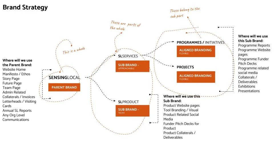
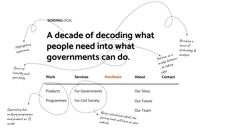
We did not start with a logo. We started by mapping how the organisation fits together: one parent brand, a sub brand for services, a sub brand for the product, and aligned branding for every programme and project underneath.
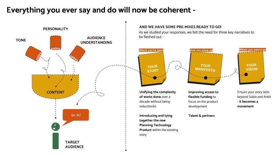
Then we worked out how it should sound. Tone, personality and audience came first, and from them three narratives ready to use: the story, the manifesto and the vision.
Last came the line and the structure of the site, with every word chosen for a reason.
One idea: two worlds
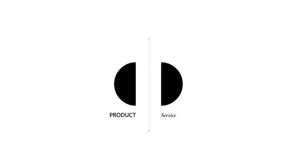
Sensing Local lives in two worlds. One is a product: structured, precise, built for governments. The other is a service: fluid, open, built to listen to people.
Most brands would pick one. We made the tension the idea. A single whole that can be seen as two halves became the starting point for every design direction that followed.

Many directions, one strategy
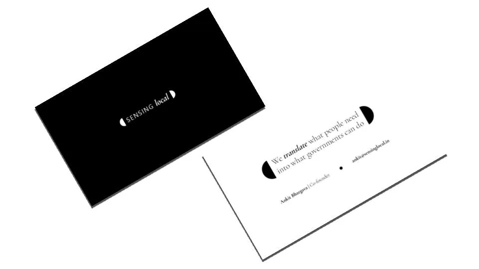
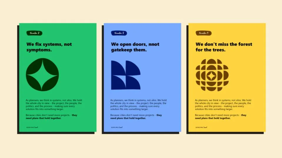
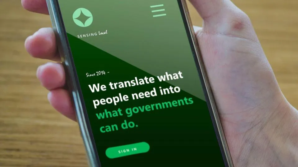
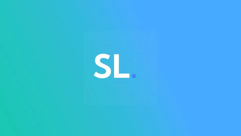
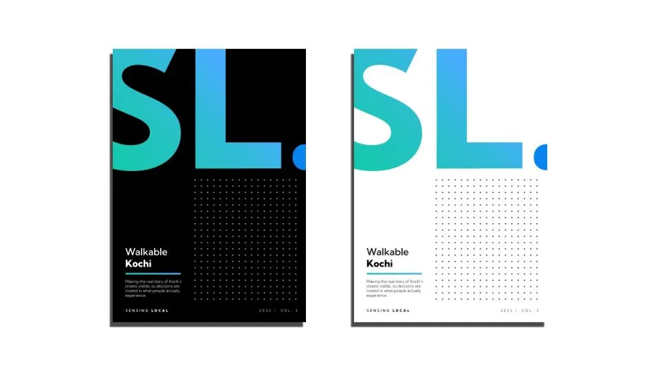
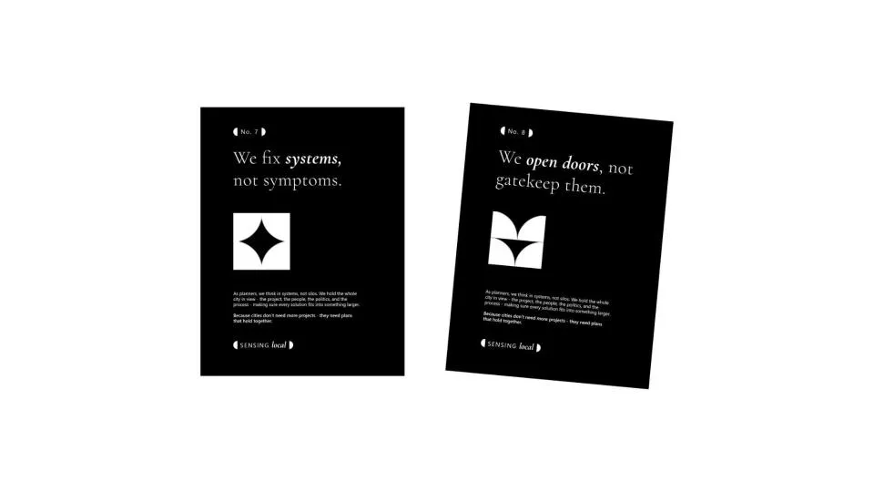
From that one idea we built complete directions, not sketches. Each has its own mark, its own voice on a poster and its own life on a screen, so it can be judged as a real brand.
Each one answers the same strategy in a different way.

The details
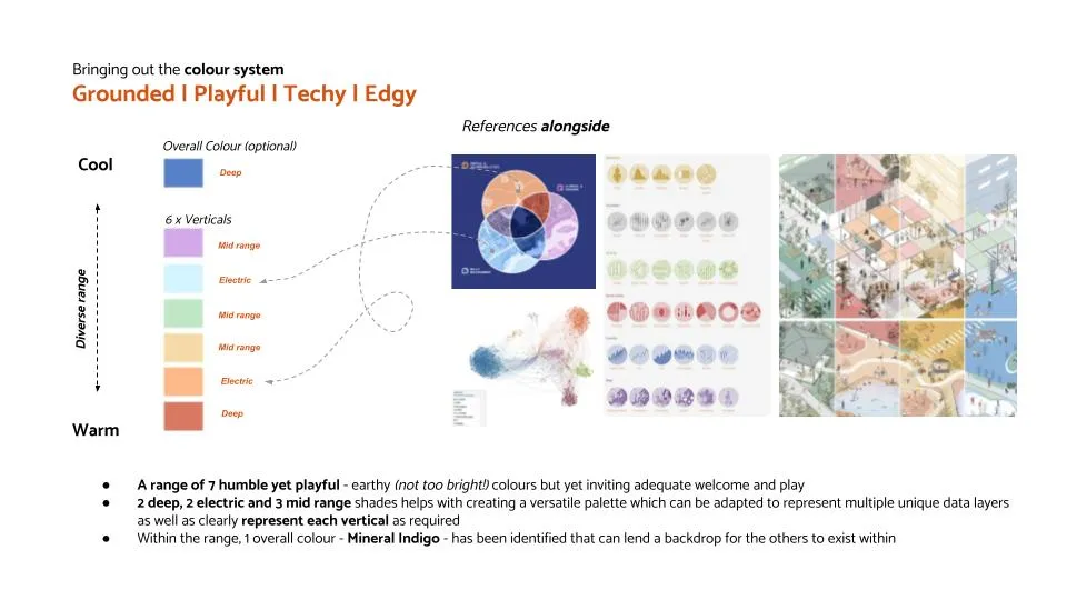
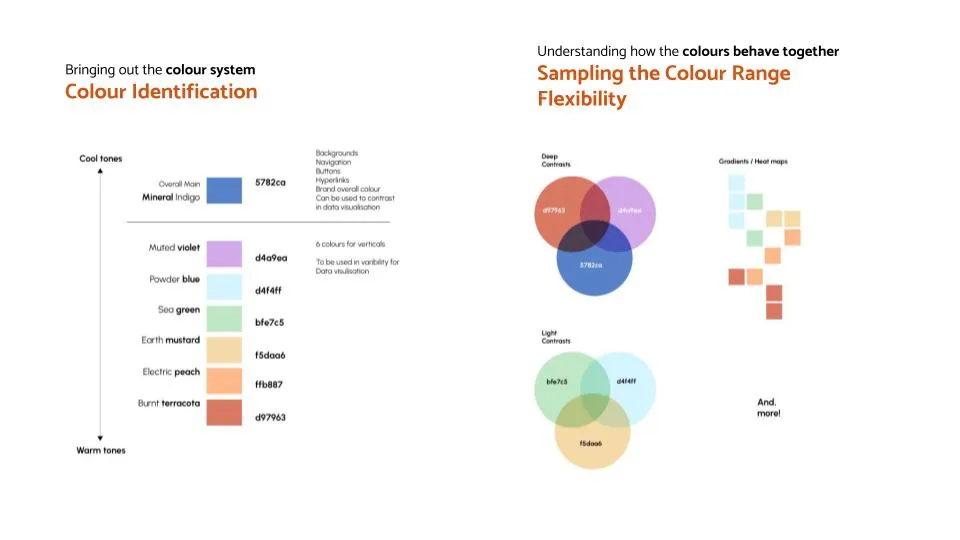
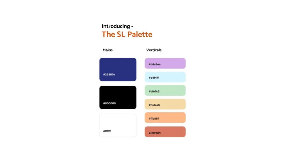
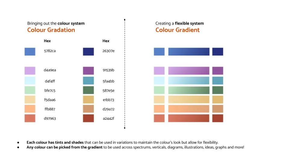
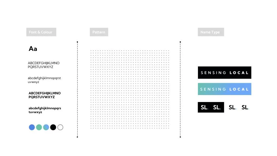
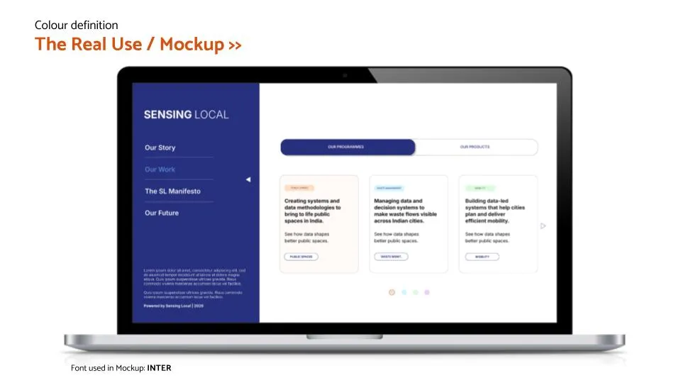
Every direction was taken down to the details: typefaces, colour palettes, patterns and how the name is set. Then each was tested in real use, so the choice could be made on evidence and not on taste.