The Ground Line | Mumbai
Giving two decades of building a name to stand on.
- Client
- The Ground Line
- Scope
- Verbal identityVisual identity
- Year
- 2026
- Location
- Mumbai
- Status
- Complete
The brief
Twenty years of real estate in Mumbai. Not one day of branding.
The company had the experience and the expertise. What it didn’t have was a face. No name people remembered, no logo, no single way of showing up.
Now it wanted to speak to a new generation of buyers and partners, without leaving two decades of know-how behind. It needed a fresh look that still felt earned.
First, the name
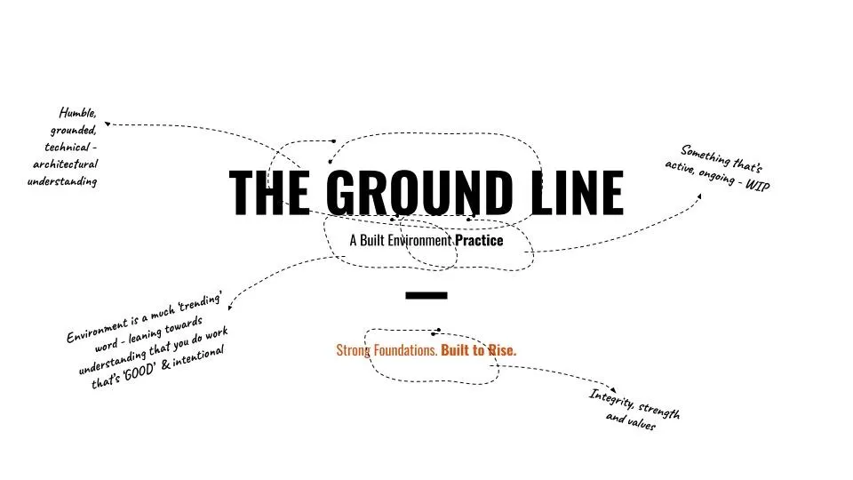
We started with what to call it. In an architect’s drawing, the ground line marks where the earth ends and the building begins. Everything rises from it.
It suited them. Humble, grounded and technical, with strong foundations underneath. A name that carries experience without sounding old.
One line through it
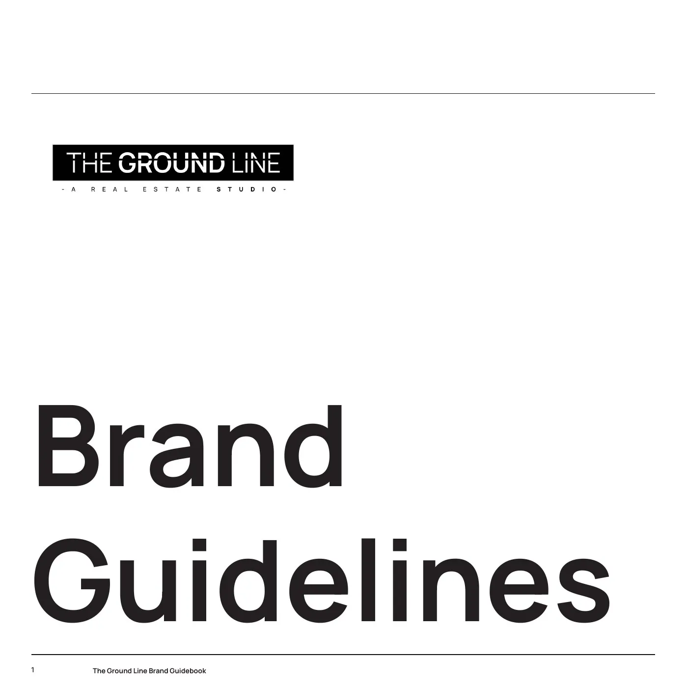
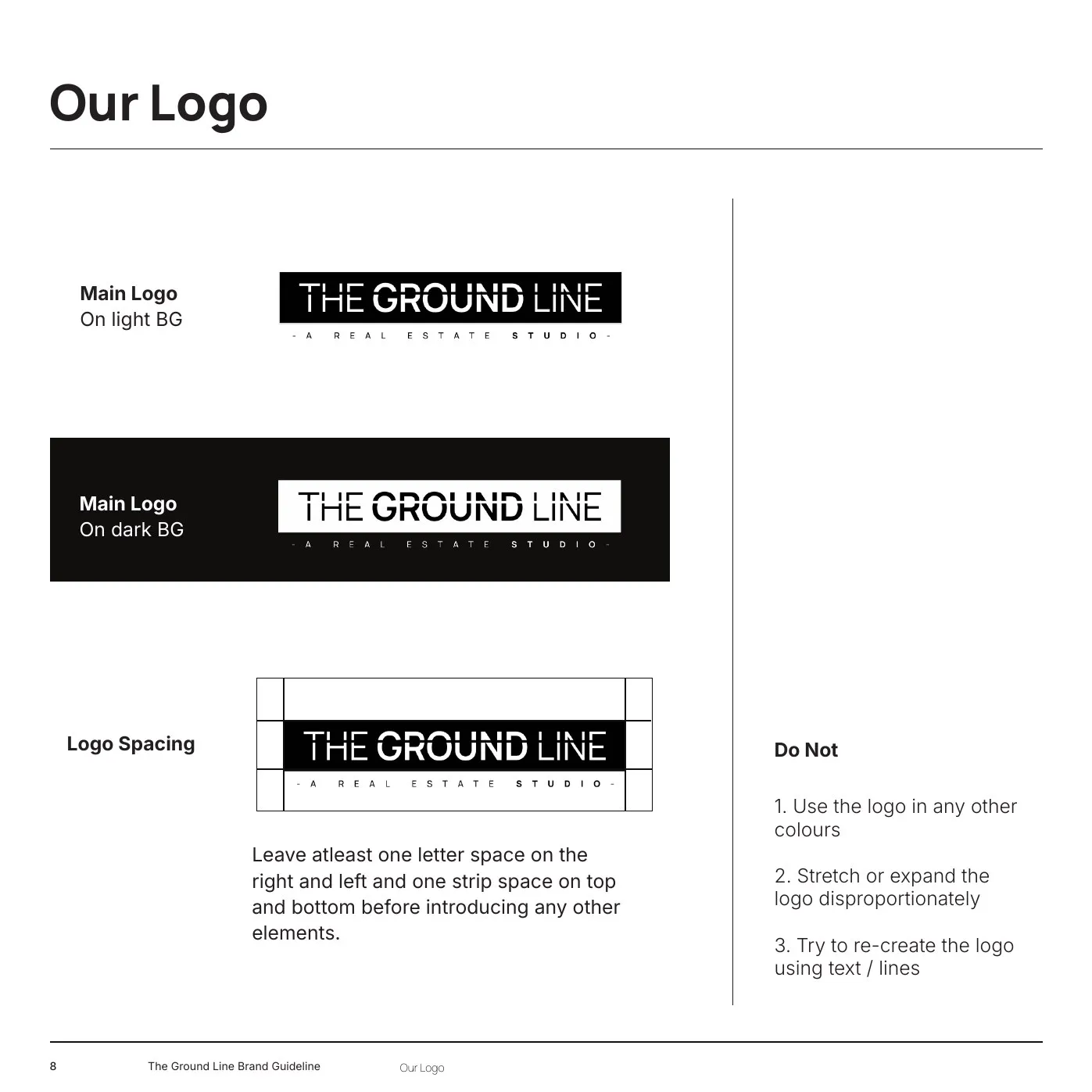
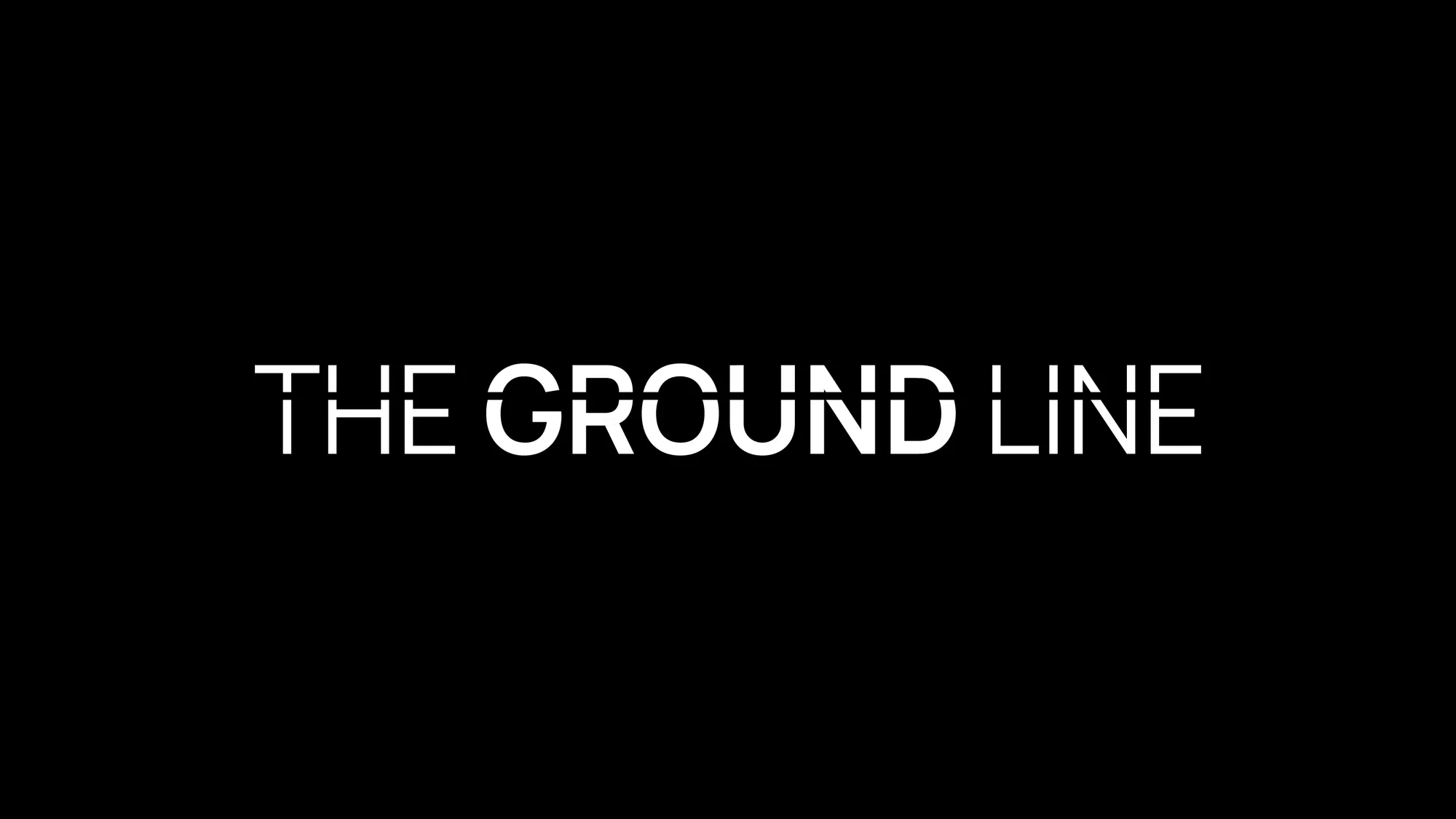
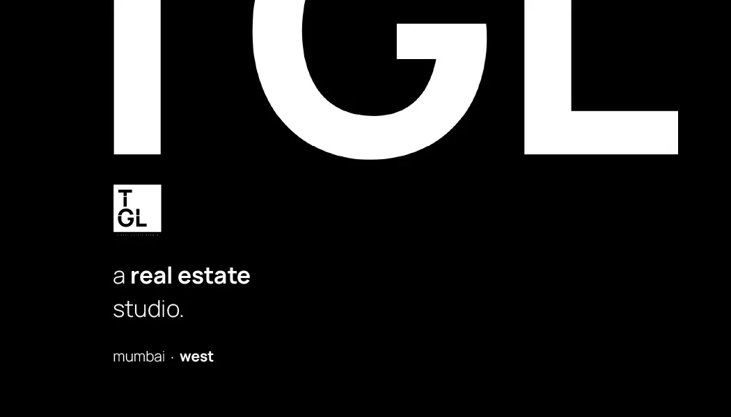
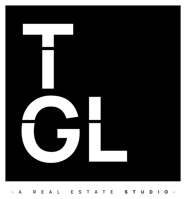
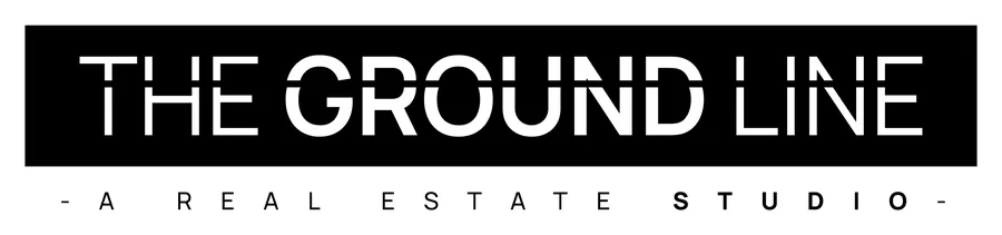
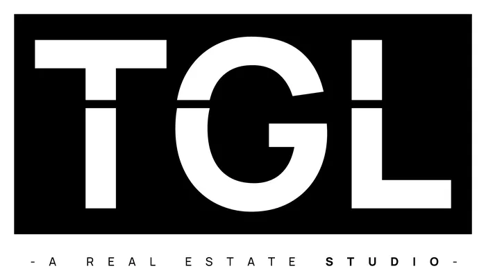
The logo is only the name. No symbol, no icon. Just one clean line drawn straight through the letters.
That line is the ground line. Above it is what people see. Below it is what holds everything up.
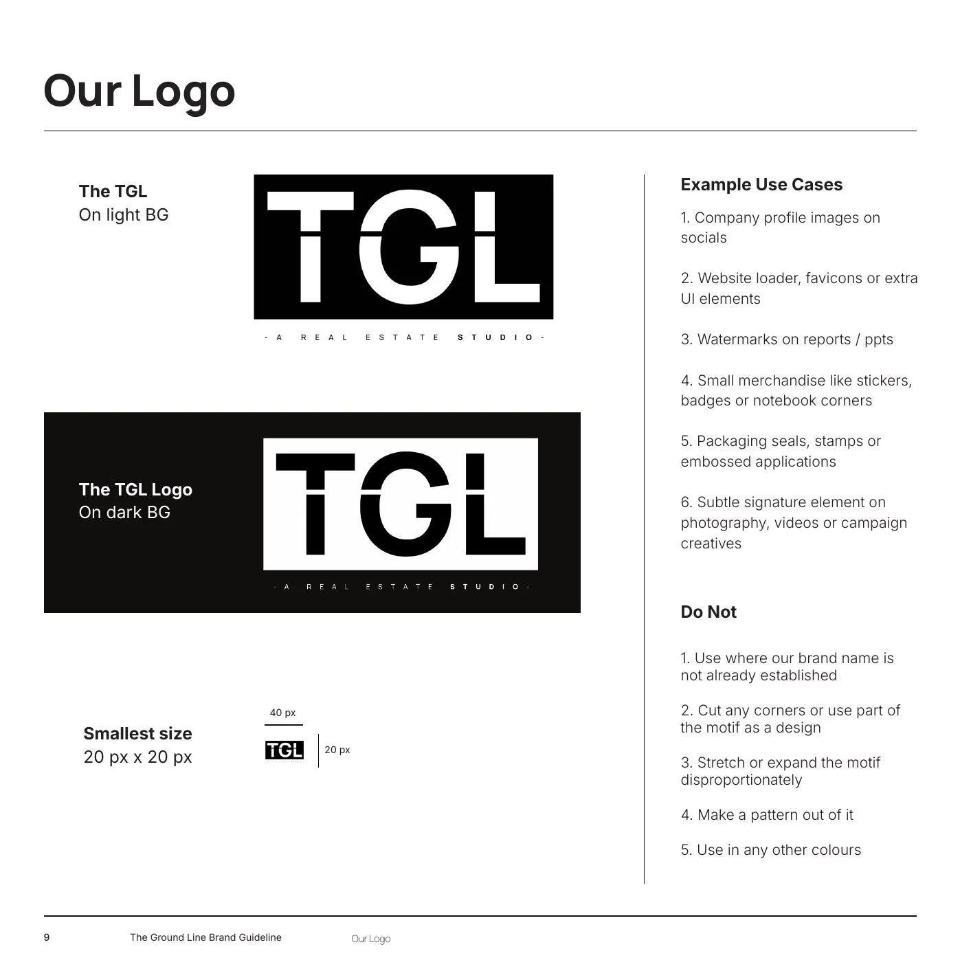
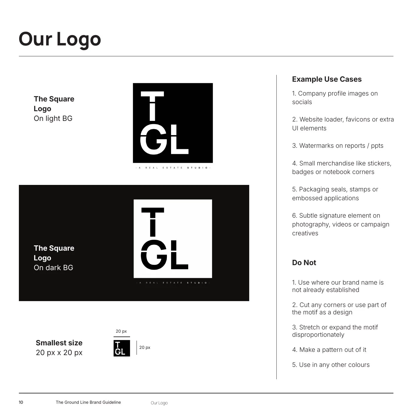
It shortens to TGL for small spaces and stacks into a square for profile pictures and stamps. The line runs through every version.




Simple on purpose
Everything else stays out of the way. Black and white. One typeface. Plenty of space. The buildings should stand out, not the branding.
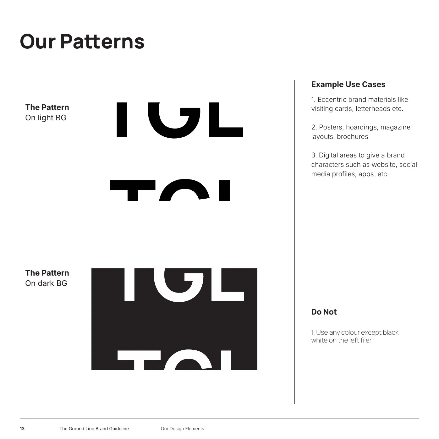
The boldness comes from scale. The letters TGL, blown up and cropped at the edge of the page, became the pattern: calm most of the time, loud when it needs to be.
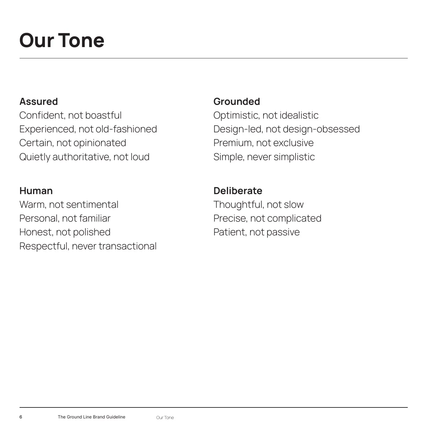
The voice follows the look. Assured, grounded, human and deliberate. Experienced, not old-fashioned.